You need a pair of red-cyan cellophane glasses to view these stereo images.
Lewis Morley showed me how to create stereograms with a regular 2D paint program at Conflux 2007. He used Photoshop, I use Acorn, but it will work with any paint program that supports layers and blending.
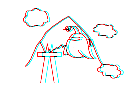
First is a quick sketch converted into a stereogram. If you look at it without the glasses, you can see that each shape is drawn twice, one in red, once in cyan, and slightly offset. When viewed with the glasses, the left and right eyes see only one of each shape, with the difference fooling the brain into seeing real 3D depth.
The bottom layer is a solid white background. On top of that you need a layer for each set of objects at similar depth which might overlap others. In this sketch, there is one layer for the mountain and another for the clouds, spaceship, and steeple.
Each of these depth layers in turn divides into two layers, one for the red right eye image, one for the cyan left eye image. From bottom to top, the five layers are background color, red right eye background, cyan left eye background, red right eye foreground, cyan left eye foreground. All the layers above the background have "multiply" as the layer blend.
I drew the original sketch in Illustrator, stroking paths in red and copying & pasting into the right eye layers, then changing the stroke color to cyan and copying & pasting into the left eye layers. You could instead paint the shapes directly in your paint program. At this stage, the shapes should overlap exactly so the final image has a single black outline for each shape.
Next, step through each cyan left eye layer, select each shape, and move it a few pixels to the right. Or, step through each right eye layer and move the shapes a bit to the left. It doesn't really matter which eye you pick, but being consistent makes it easier to remember which ones you've moved and which haven't if you need to backtrack. Note that the left eye image is shifted to the right. (Hold your thumb up at arms length and in line with a tree / pole / vertical line, then shut your right eye. Your thumb appears to move to the right. With the other eye, the scene moves in the opposite direction.)
The further apart the left and right eye shapes are, the "closer" it will appear when viewed in stereo. But if you separate them too much, the stereo illusion breaks up and you'll see two independent shapes, one red, one cyan. I shift the background shapes by 2 to 8 pixels, the foreground by 8 to 16 max.
(This also depends on the resolution of the display device, these distances work OK on a standard monitor, but can be increased for an iPhone.)
Once you're happy with the separation and stereo effect, make all the right eye layers invisible and go through the left eye layers to erase lines that should be hidden; then repeat for the right eye layers. You can't just fill in the paths with solid color to hide those underneath because the overlapping red and cyan paths need to bleed through.
The result is an image that looks as if it were composed of multiple cut-outs floating some distance above each other.
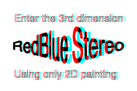
This second stereogram is me playing around with text. The top and bottom rows are standard Helvetica, but outlined rather than filled. I think that wireframe style graphics look really good in stereo, often better than solid shapes. This may be because having more vertical lines to focus on increases the effectiveness of the stereo illusion. Or maybe I'm just a sucker for Tron-style retro graphics.
The text in the middle should appear to recede away from you at the sides. First I did a 2D perspective distort on each half of the original text and copied that into the left eye layer. Then I copied the text into the right eye layer and stretched it horizontally before shifting, so the separation between the red and cyan letters is less at the edges than at the centre.
The text doesn't appear quite right to me, and I think this is because the perspective distort and the separation were done as separate operations by hand and therefore don't match precisely. It would be easier and probably more effective to do this kind of stereogram in a 3D program: render in wireframe or flat shading twice, adjusting the camera position slightly for the left and right eye views. Still, if you don't have a 3D program handy, it is nice to know you can still do this.
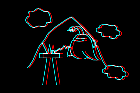
This last stereogram is where things gets a bit weird.
I changed the background layer to solid black, and the blend option for all the other layers to "lighter."
Looking through the glasses, you should see the same scene as the first image, but this time inverted with white lines on a black background.
Now look closely at it without the glasses.
These are the same red and cyan paths - exactly the same RGB values - but now when combined by the glasses they appear as white lines instead of black.
Also, now the red paths have to be shifted to the right of the cyan paths, the opposite direction to the black on white image.
The human visual perception system is really interesting!
Back to Graphics