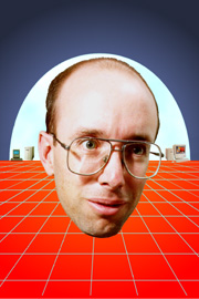
This is my pretentious cyberpunk wannabe tribute to William Gibson. It's based on the cover art for the 1993 Harper Collins edition, which of course nobody remembers anymore.
Tools: PhotoShop 3 on a PowerMac, HP ScanJet, Polaroid
Digital Palette
Final form: Photographic print and (reduced to quarter size)
Web page image.
The Department of Computer Science where I work has a staff photo board outside reception to make recognising people easier. Normally the photos are taken by the university graphic design people, but I decided that I wanted a custom job. Specifically, I wanted to base it on the cover of one of my favourite books, Neuromancer by William Gibson (the Harper Collins paperback edition).
The head is one of six portrait shots taken by the staff photographer at a photo shop. It wasn't a full studio session, but the quality was much better than either a passport photo or the digital cameras (Apple QuickTake) at that time.
I drew the grid and skyline curve with pencil, ruler, and compass on paper and scanned that as well, for use as a guide. The red and blue background was done as two radial fills from the centre out with half the image selected at a time. The light blue sky was a curved path traced over the pencil sketch layer. I filled the path with light blue, softened the edges with the paintbrush, and then applied the Clouds filter. The Macs behind the head were scanned from magazine and brochure pics, with a bit of light level adjusting and then reduced to fit. The grid started as a set of stroked paths traced over the pencil sketch layer. I wasn't happy with the jaggies on the grid though, so redrew them with the line tool with antialiasing turned on.
The final image was printed on a Polaroid CI5000s Digital Palette. These were the days before digital cameras became cheap and laptops with PowerPoint became the standard presentation tool. Photographic slides and projectors were still common for high quality presentations (as opposed to drawing on transparencies with markers), so you could also buy "printers" that transferred your images to photographic film that you then developed. Load one with standard ISO 35mm film and you got standard negatives as if they came from a camera.
As you might have guessed from the way I've gone on and on about it, I'm very proud of this photo. The process of creation was a lot clunkier than it would be with today's digital technology, but I still get positive reactions from people seeing it for the first time. Interestingly, some thought that I did just scan in the cover and replace the head with my own, despite the many small differences. I took this as an indication that I successfully captured the essence of the book cover.
Back to Graphics